YUKI’S Brand Identity Design
Client:
Kei Developments
Scope of work:
Brand Identity Design
We worked with Kei Developments to create the brand identity design for YUKI’S, a lifestyle brand offering a wide range of daily essentials. The brand name, inspired by the founder’s daughter, reflects the Japanese meanings of happiness and snow. These values became the foundation for the design direction and overall brand narrative.
Our goal was to help transform this personal story into a professional, scalable, and versatile brand design system. Since YUKI’S is positioned around life essentials, the identity needed to communicate trust, warmth, and cultural authenticity while remaining competitive.
Development of the Brand Identity
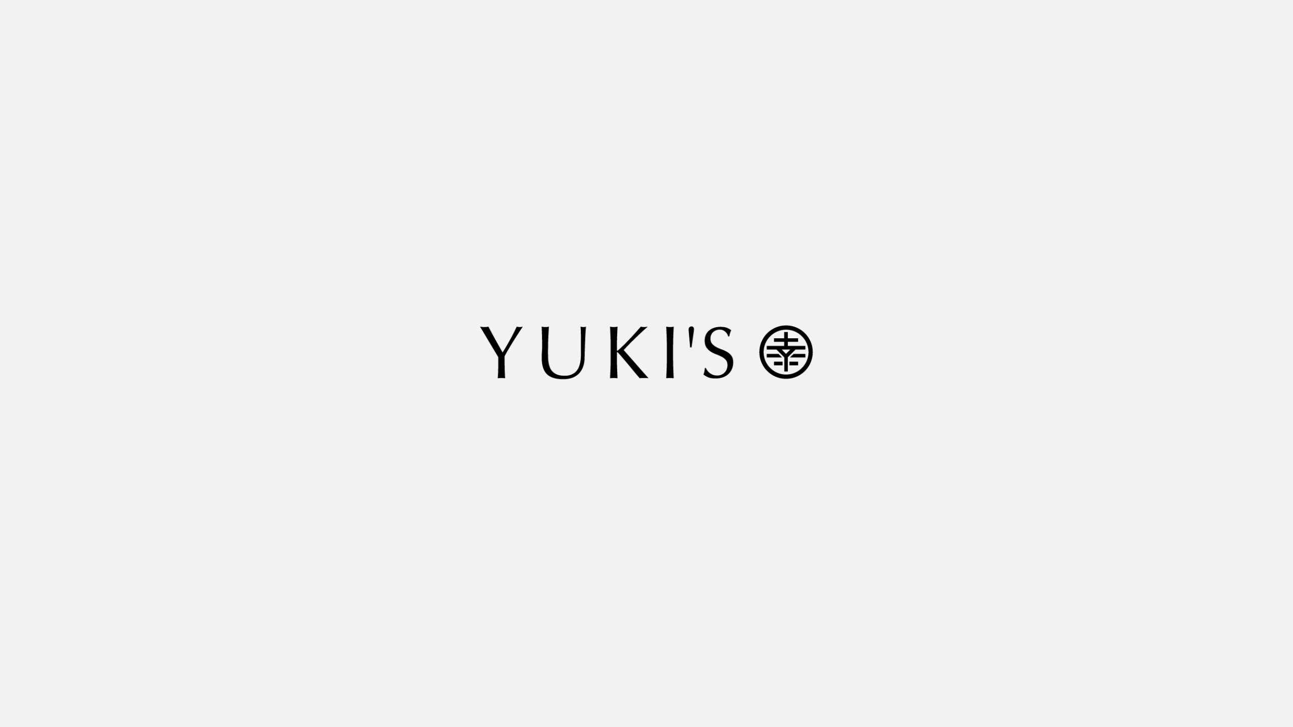
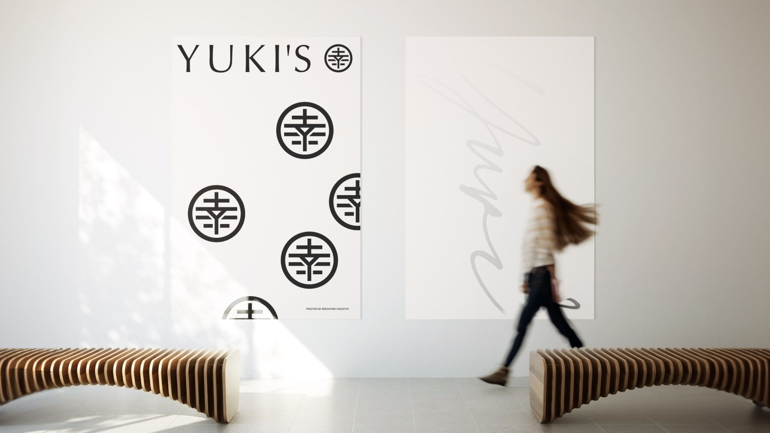
The logo design emphasizes the meaning of happiness by incorporating the Japanese character 幸 as the core symbol. This choice not only reinforces the cultural foundation but also creates a distinctive and recognizable visual mark.
To further strengthen the identity, we placed the character within a circular structure. This reference to Japanese family crests (kamon) symbolizes unity, heritage, and continuity. The circle form ensures the design is both timeless and adaptable, allowing the logo to transition smoothly between traditional and modern applications.
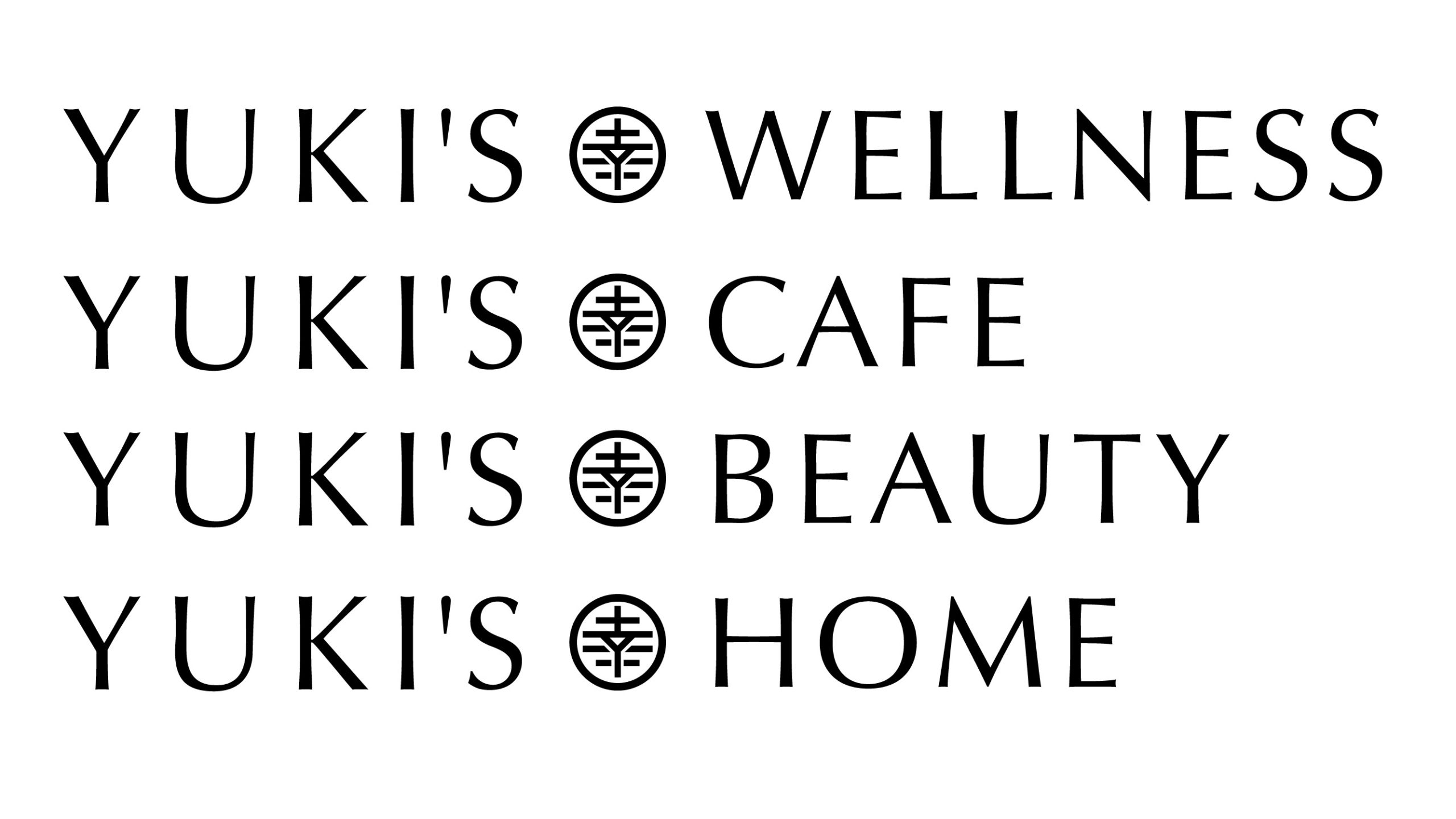
The Logo System
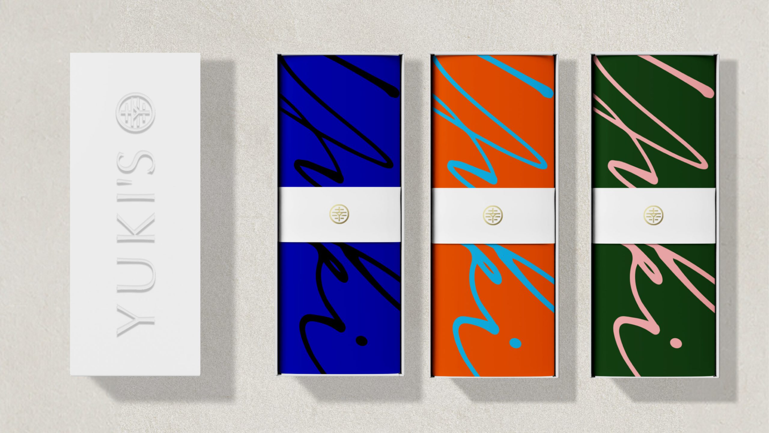
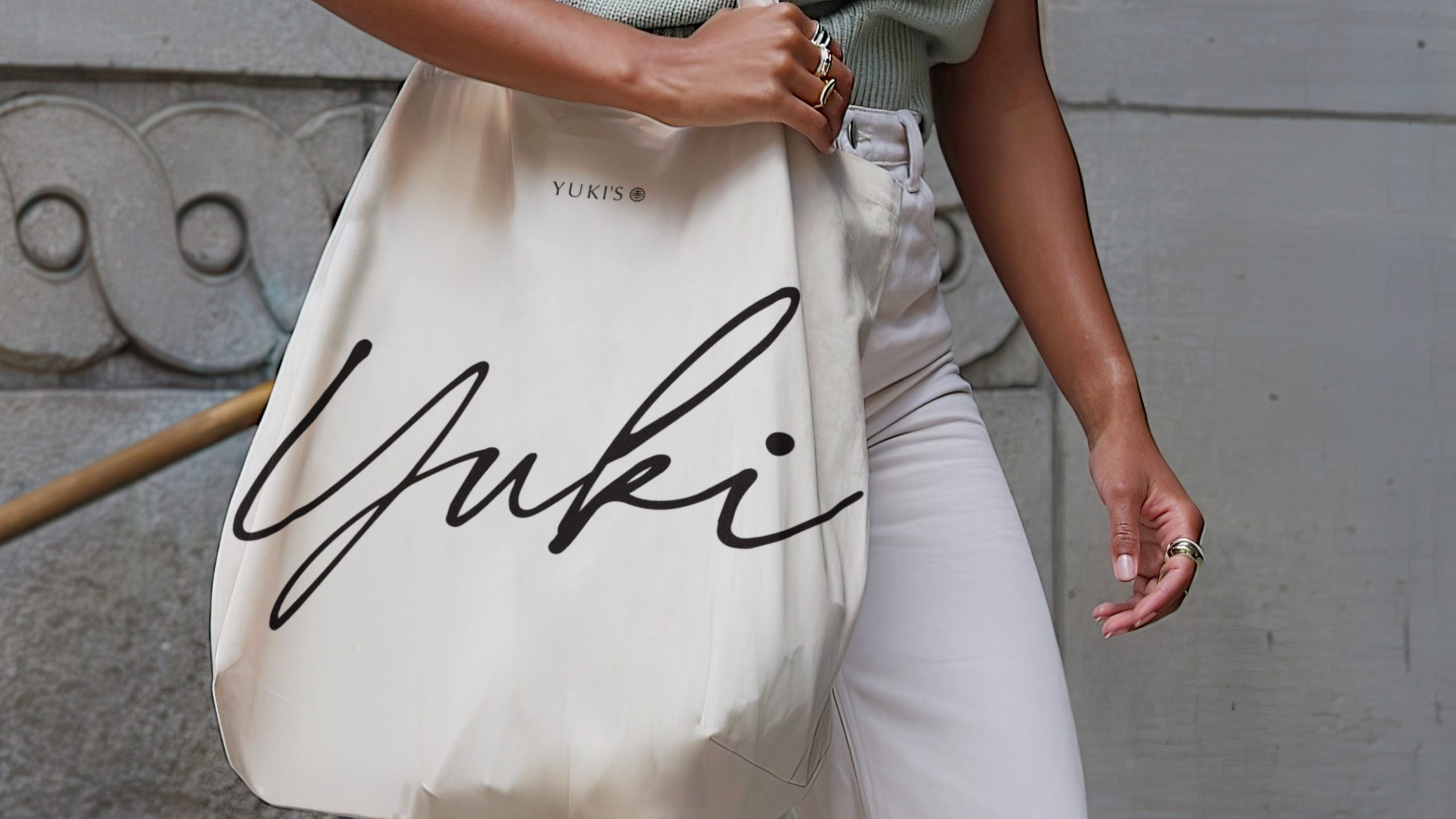
In addition to the logo, we developed a complete logo design system. This included typography, a refined color palette, and supporting graphic elements. Each design choice balanced serenity and optimism: snow symbolized purity and calm, while happiness inspired uplifting tones and approachable shapes.
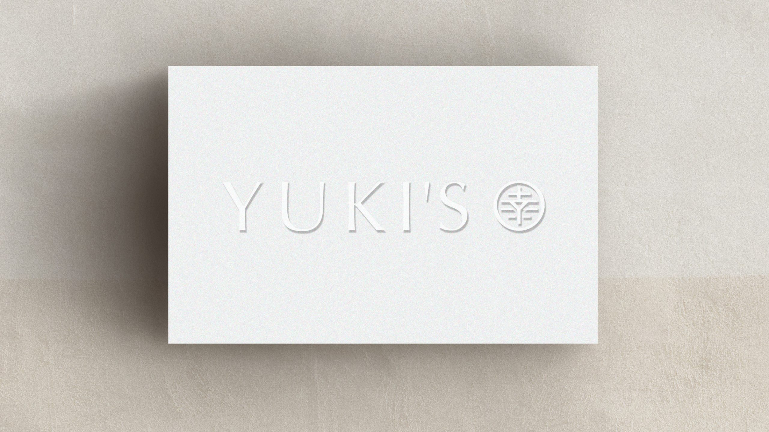
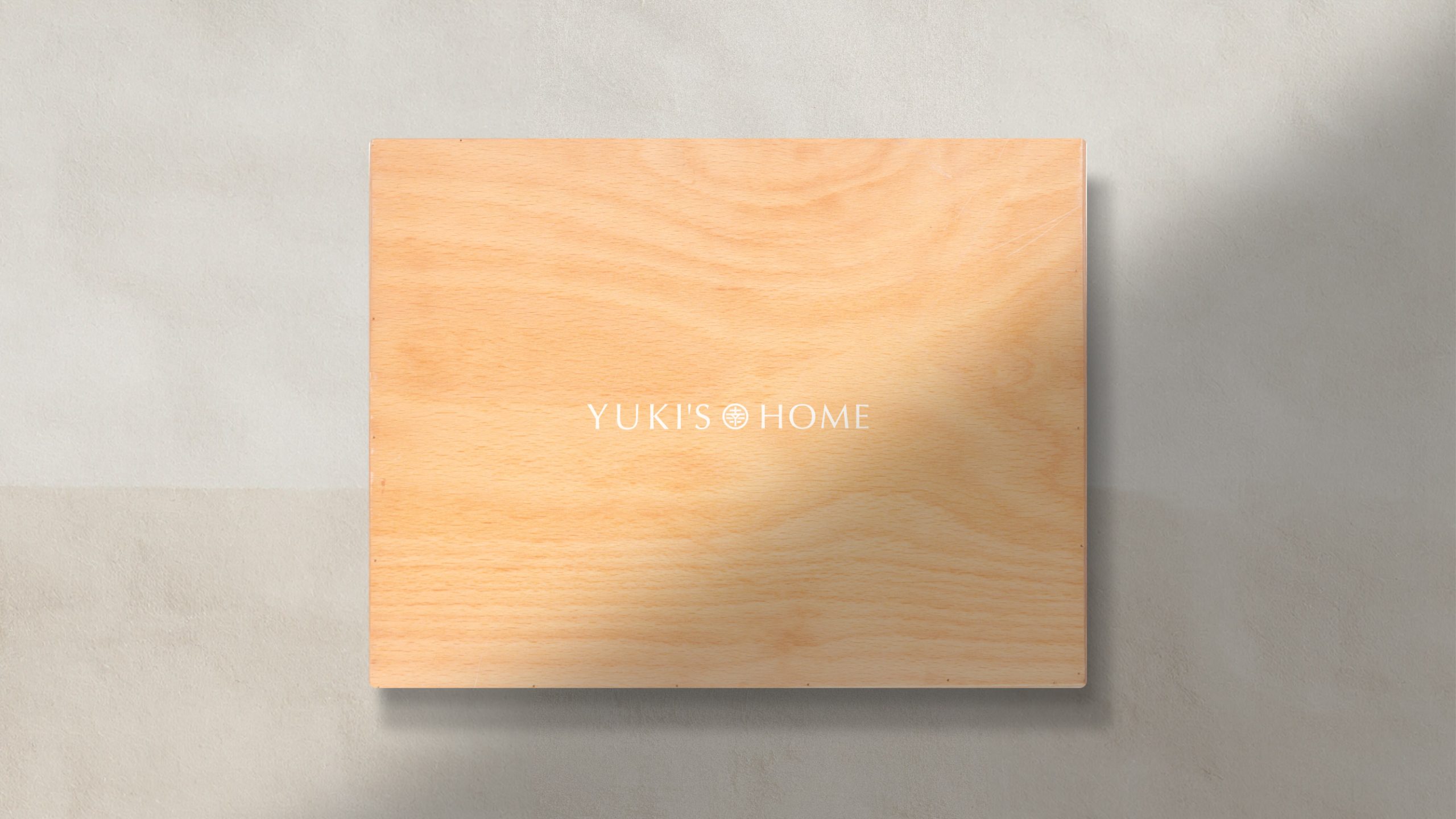
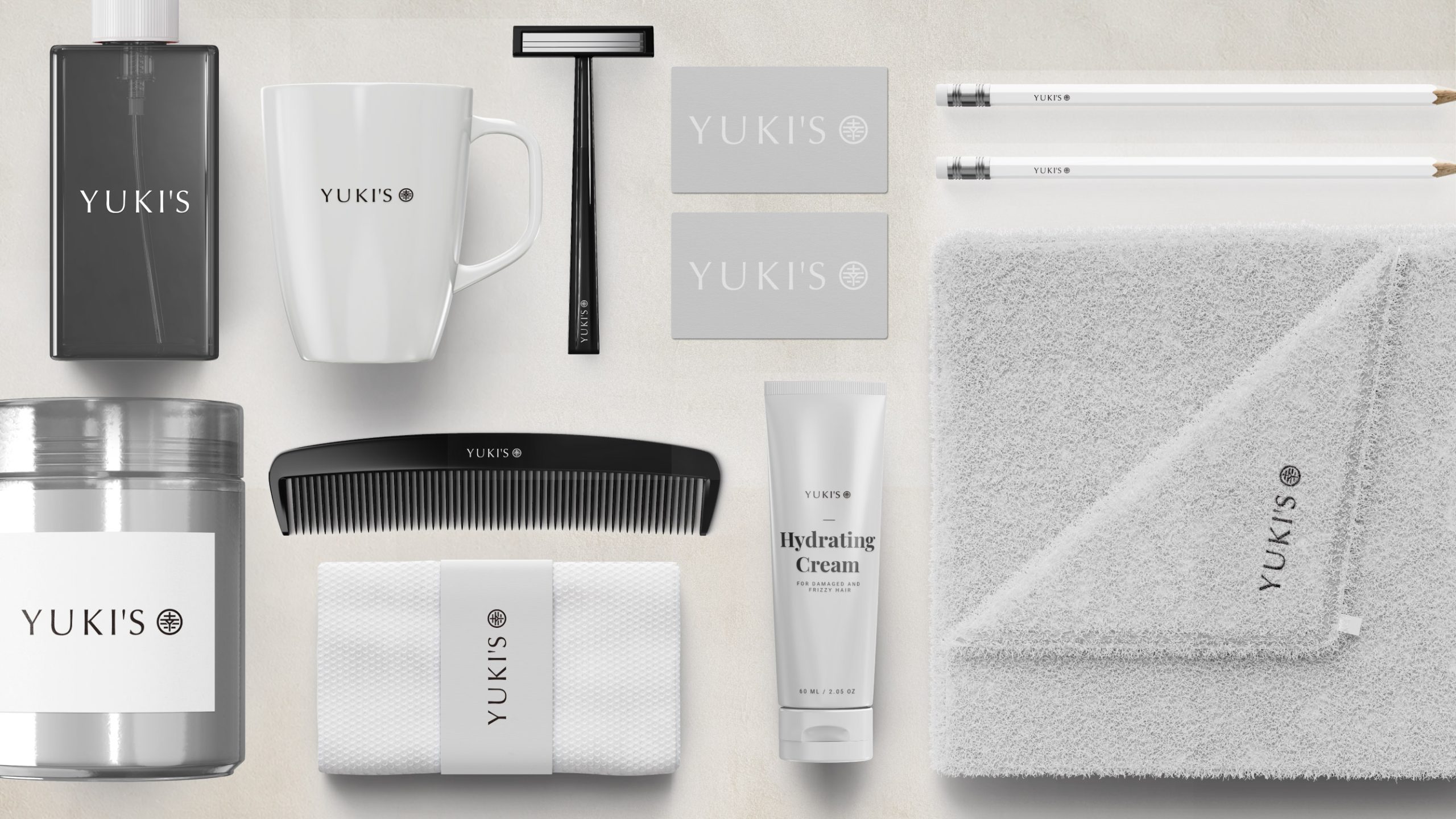
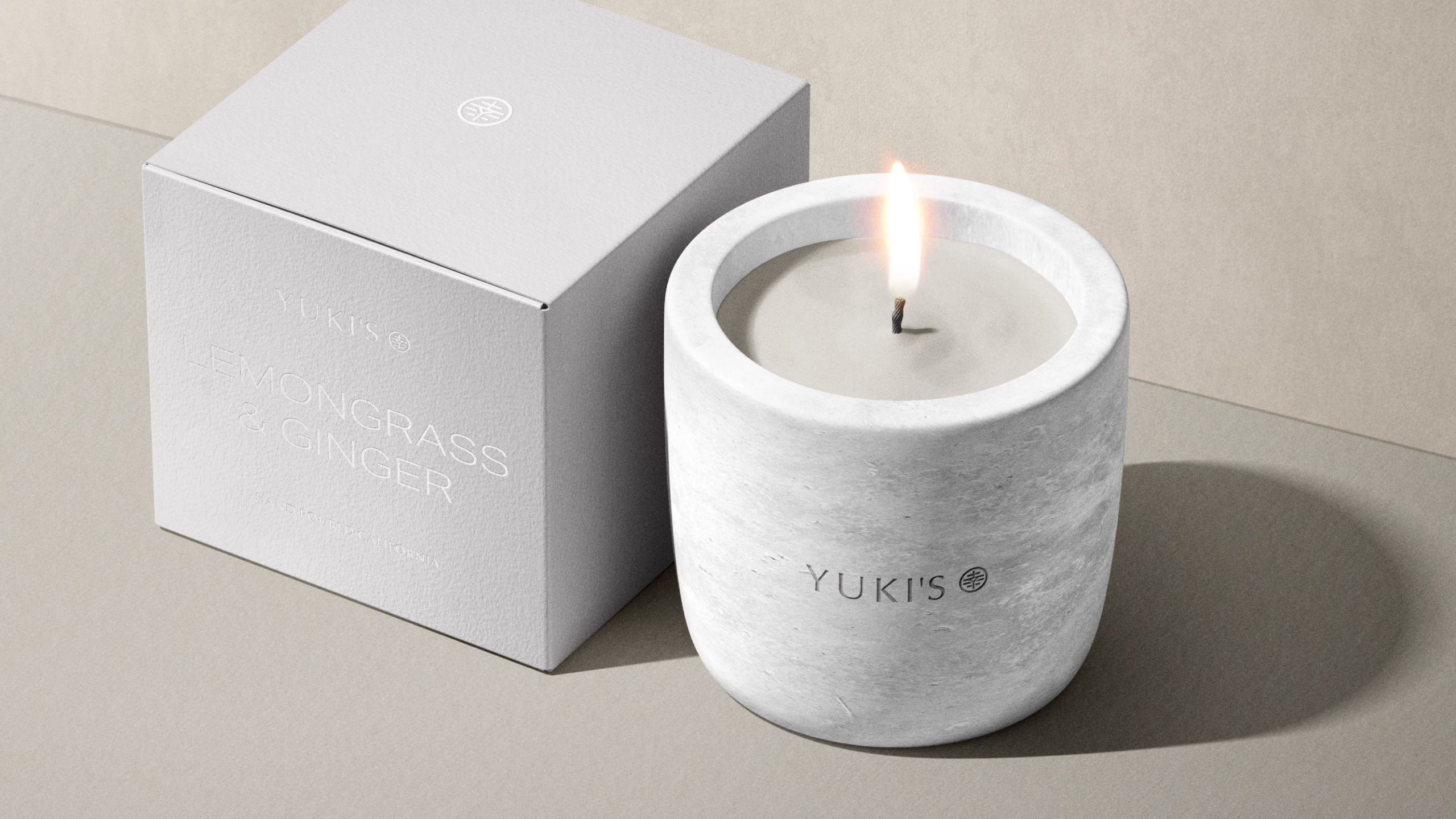
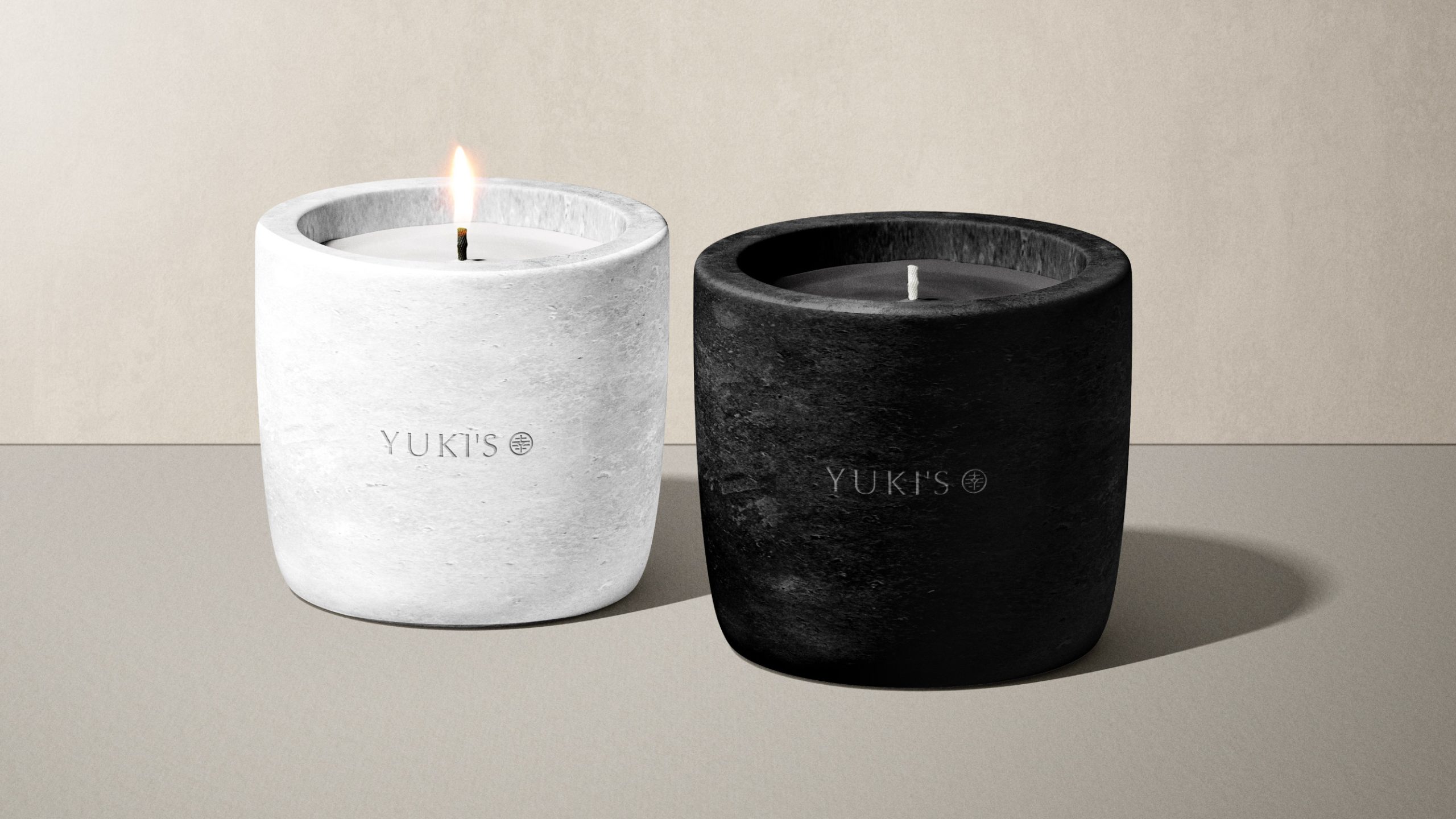
As a result, the identity system feels consistent, flexible, and visually clear across multiple touchpoints. It adapts seamlessly to packaging, product labels, digital platforms, and environmental graphics. Moreover, the structured framework supports long-term scalability as YUKI’S expands its product and service offerings.
Design Outcome
Through this project, we helped Kei Developments translate a meaningful family story into a professional brand identity design. Every element reflects careful design execution—from the emblem’s cultural depth to the clean, versatile application system.
By combining cultural heritage with modern design principles, YUKI’S now has a cohesive identity that resonates with audiences, builds trust, and positions the brand for sustainable growth. The design solution balances emotional resonance with professional credibility, ensuring YUKI’S communicates happiness, warmth, and reliability at every customer touchpoint.