Awarded Branding & Packaging Design – EUTOPIA ORGANICS
Client:
Sino Trading Ltd.
Scope of work:
Product Brand Identity & Packaging Design
Awards:
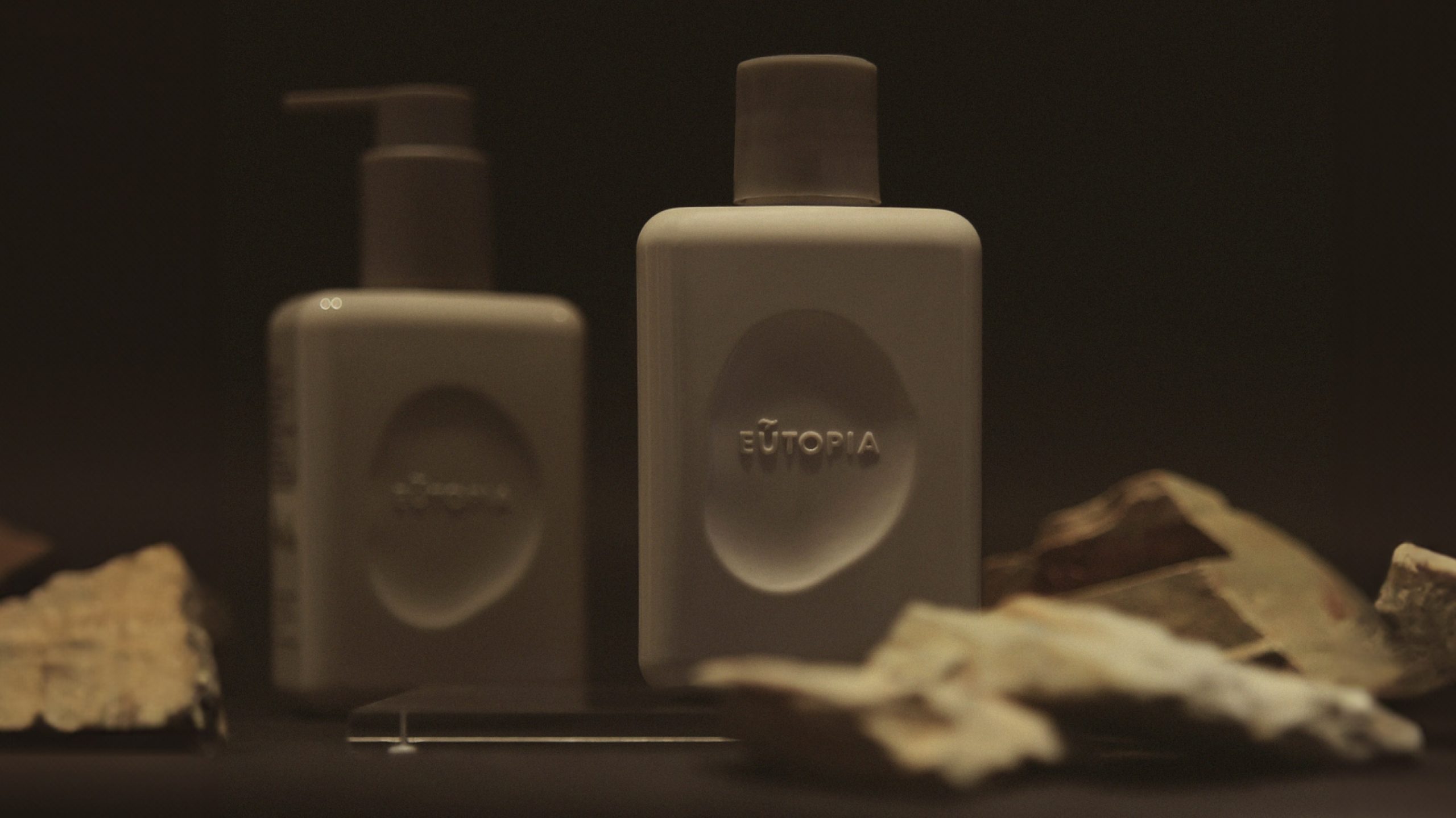
We create a brand identity that would reflect our client’s new product – high standard organic shampoo product. Our work began with the brand name, which draws inspiration from the idea of Eden’s garden evolving into a utopia. This concept immediately set the tone for a brand world built on purity, growth, and harmony.
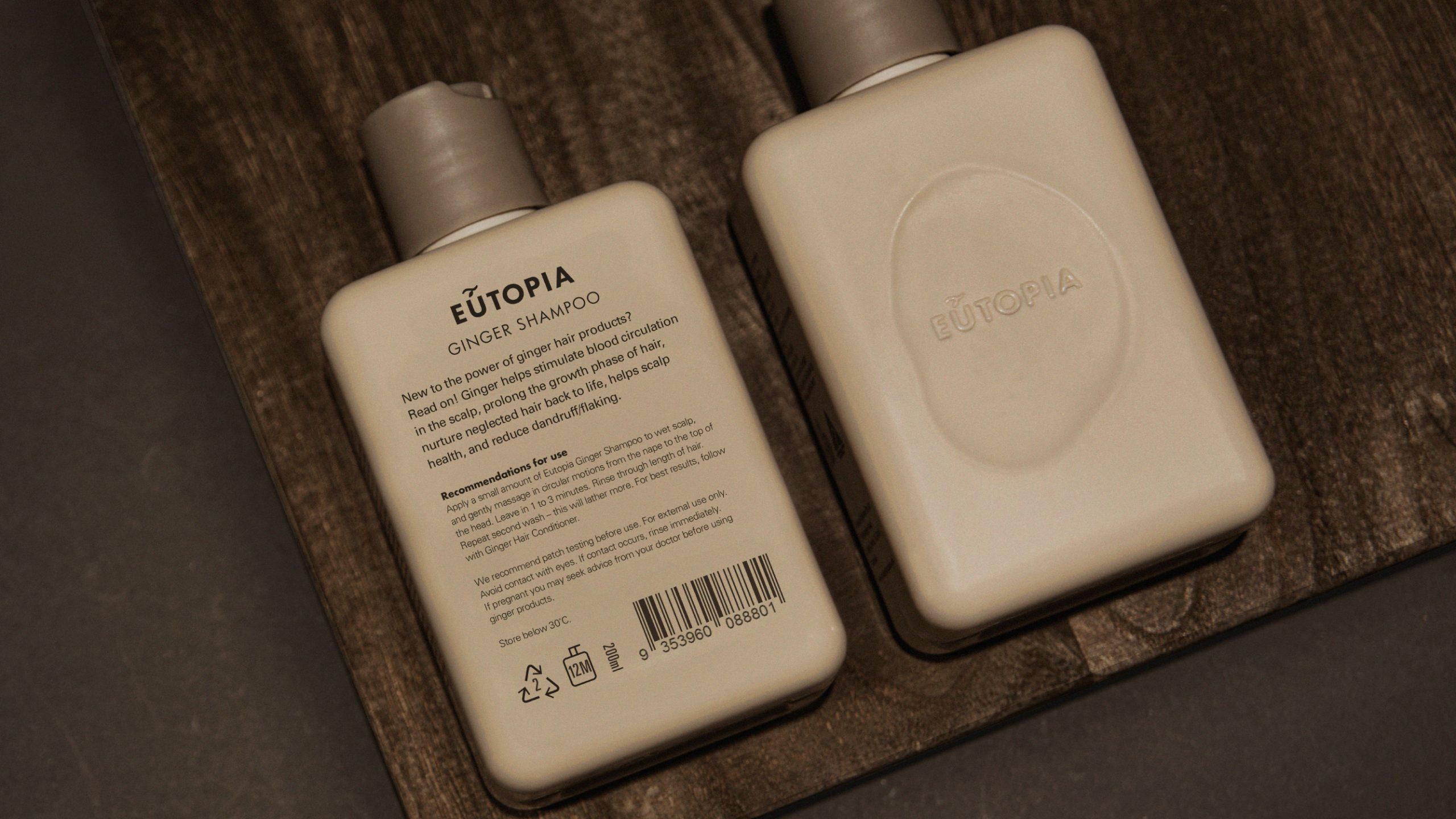
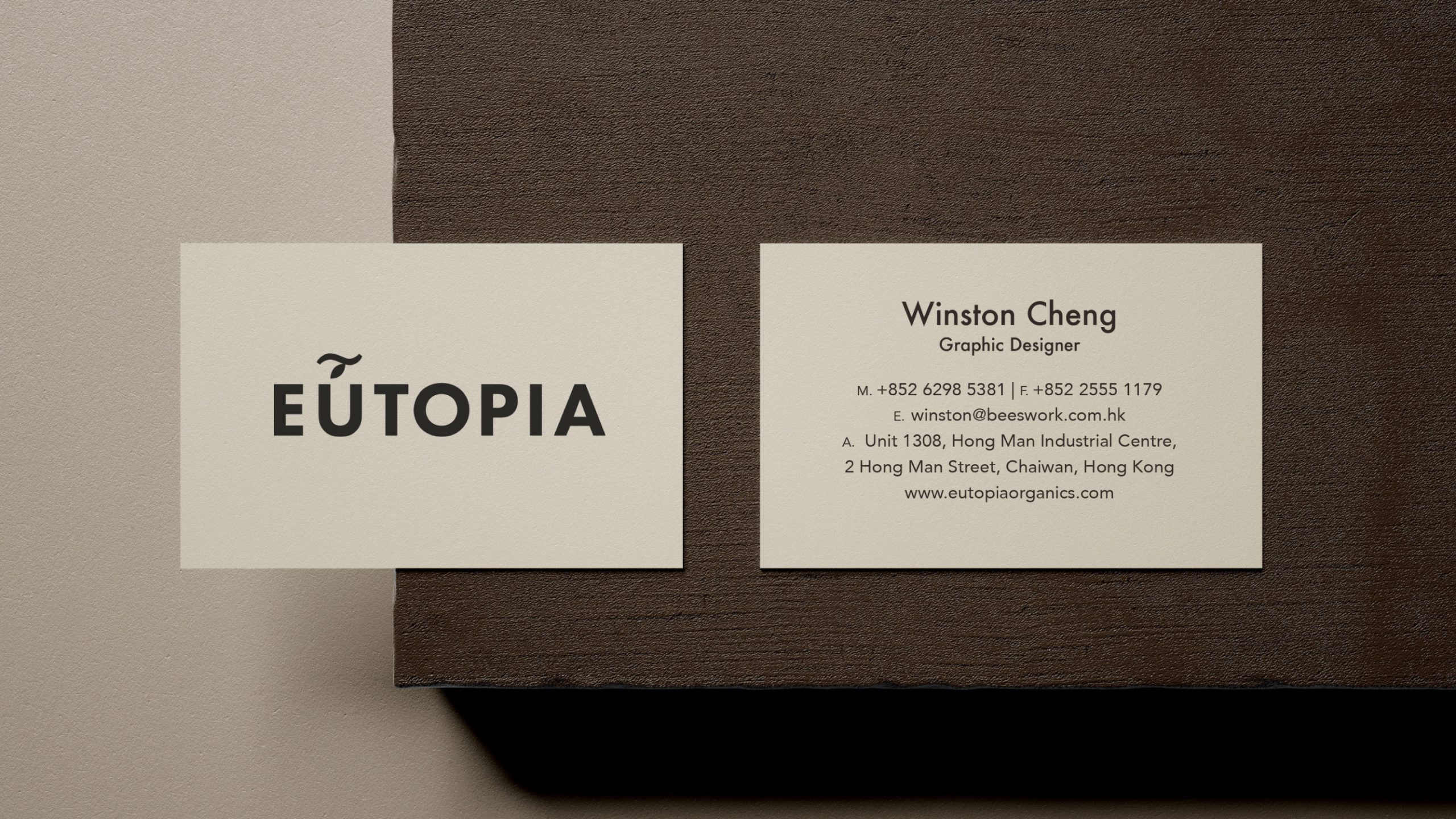
From there, we developed the logo, identity system, and full packaging design. Each element was crafted to highlight originality and authenticity. The logo combines natural balance with modern clarity, while the visual identity builds trust through a clean, confident design language.
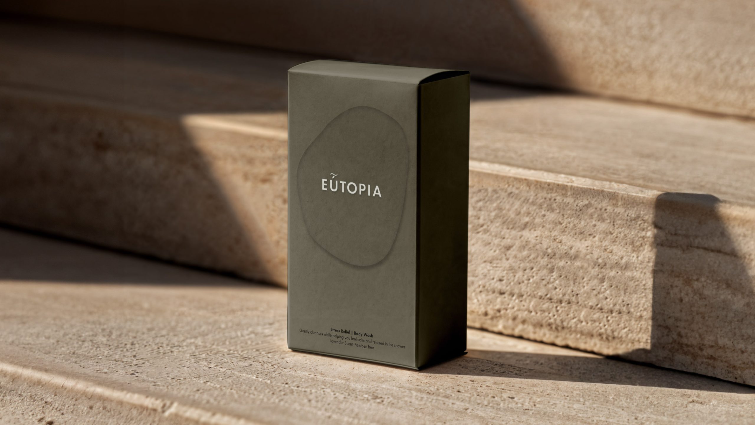
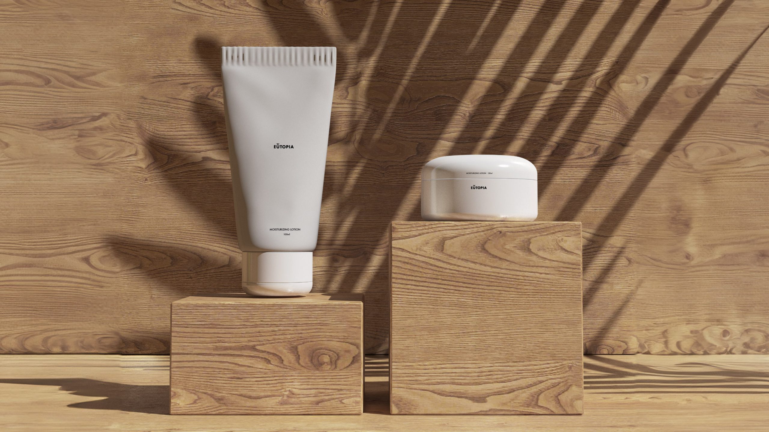
The packaging design plays a central role in communicating the brand’s values. We used materials, textures, and layouts that emphasize natural origins. At the same time, we created graphics that express the quality of the ingredients and the sustainable standards of the manufacturer. As a result, the packaging feels both organic and contemporary.
In addition, the design ensures strong shelf presence without losing its connection to nature. This balance between market visibility and authentic storytelling was key to the project’s success. Moreover, it allowed the brand to stand apart in a competitive organic sector.
The outcome received international recognition. The project won the TOPAWARDS ASIA Brand Identity Design Award in Japan, which celebrates outstanding design across Asia. This award affirms the strength of Eutopia Organics’ identity and validates the importance of pairing thoughtful branding with impactful packaging design.
Through this project, we demonstrated how strategic creativity can elevate a product and connect deeply with its audience.
Concept of the logo design
–
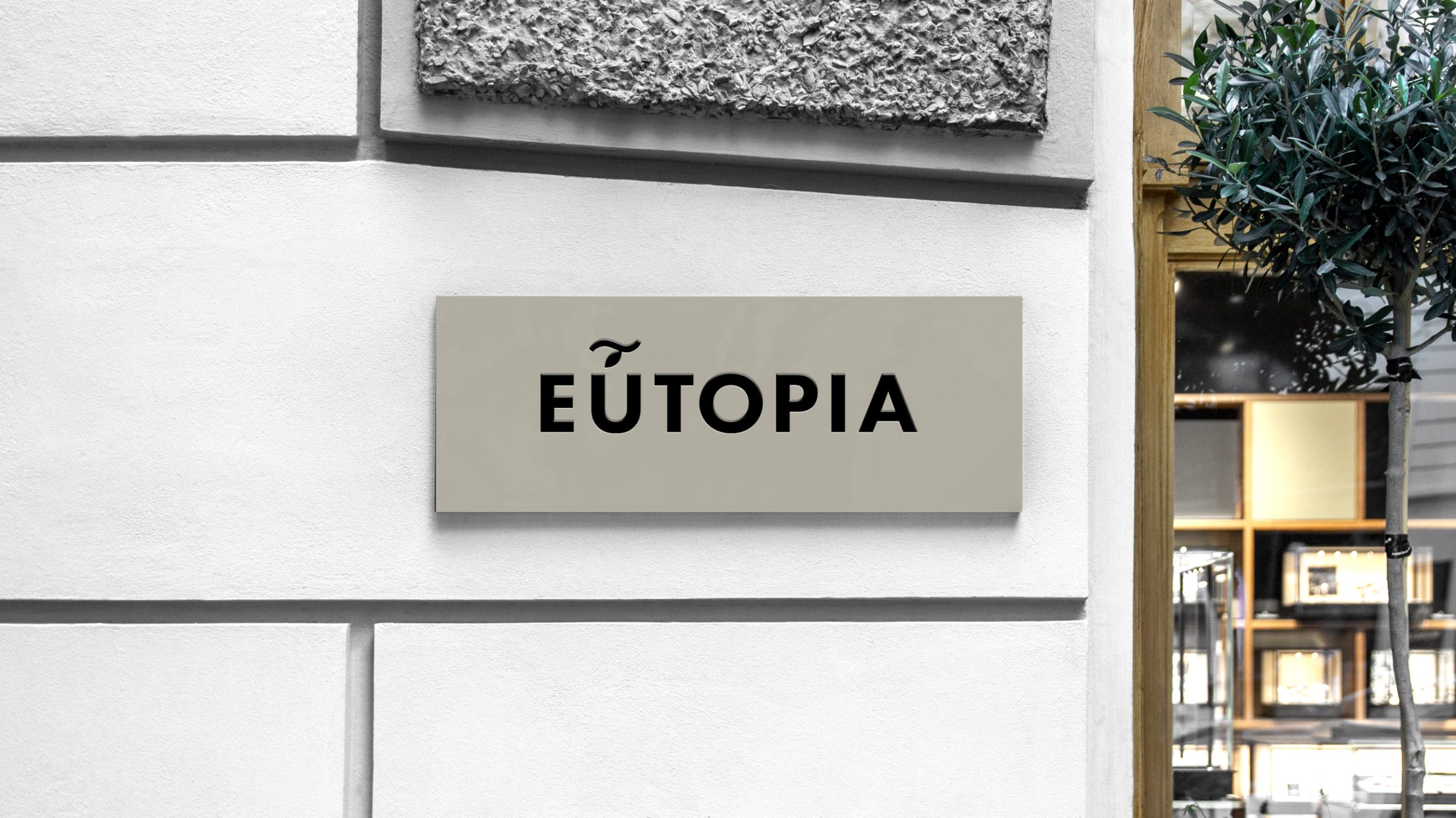
After deciding on the brand name, we moved onto designing the logo. In the original Greek, there is an accent above the “U” in eutopia (left image below). Starting with this symbol, we adapted it into a simple illustration of a branch with a hanging leaf (pictured on the right) to draw attention to Eutopia Organic’s deep connection to nature.
Brand Fonts
–
The familiar shape of the logo makes it easily recognizable and we chose Futura and Univers as the brand’s basic font type for their future packaging and printed materials. We set the slogan for Eutopia Organics as “Not just organics” to convey that the body care brand was not just another organic brand, but one that encapsulated an entire attitude towards life.